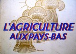
Agriculture and Fisheries, 1937
A great find: a book, published to ‘commemmorate’ the suspended ministry because it merged with Economic Affairs. Just like what happened again in 2010. The book has a couple of treasures: the cover is by Fré Cohen, a succesful female graphic designer working in the 30’s; a couple of hand-lithographed colour prints, one printed on pink paper, one sporting
Layered typography by amateurs
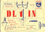
Last spring I found some typographic postcards I’d never seen before. They seemed to be ‘QSL Cards’. From internet: QSL cards are a ham* radio operator’s calling card and are frequently an expression of individual creativity — from a photo of the operator at his station to original artwork, images of the operator’s home town or
Elastic maps of Holland 1986–1998
Maps are a graphic interpretation of the physical world. I like subjective maps. Here’s a few I made, The Netherlands being the central theme. The maps are heavily deformed, yet recognizable because some striking features have been kept. The silhouette of the Netherlands proved a rewarding shape to work with. A logo and 2 illustrations
Kanarieboekjes – Canary Books 1940-50
Unique, moralist albeit humorous small books published between 1940 and 50’s by the Succes Institute, The Hague. The characteristic ‘how to become successful’ type of content may be associated with the post-war reconstruction realm. Based on the eight copies I have got (of a total of 261 titles!): 85 x 125 mm, 64 pages. The back cover is yellow
Lettering on Private Owner Wagons
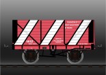
For a presentation in the Graphic Design Museum Breda (2005) I went though the trouble of creating some colour samples of lettering on English train wagons. I happen to have three books on the subject of Private Owner Wagons but they are in b&w. However, all descriptions contain detailed colour information. Apparently these books
Lettering samples for the draftsman, K. van Leeuwen, 1907
“This letter book intends to provide lettering samples to those, who need to employ letters in their profession, either by depicting them directly, either by providing the artwork. […] In contrary to printing type, in this case one could call this ‘drawn letters’ […] In contrary to printing type, in this case one could call these ‘drawn letters’.
Architectonische belettering, Cento’s publicaties, 1983
In 1983 I graduated at Academy St. Joost in Breda. My final exam project was a publication about architectural lettering which I finally managed to put together thanks to the coaching of Ton Homburg. The A3, spiral bound publication contains an essay on lettering in architecture and treats the history of lettering in four periods: arts &
Restoration of old ‘FontFont’ project
Back in 2005 Jan Middendorp approached me for a contribution to the ‘Made with FontFont’ book to commemorate the 20th birthday of FontShop: if I were interested in designing a six-page type sampler? Said he had a nice new font for me in mind: Hydra by Silvio Napoleone. I loved the typeface for its heavy duty industrial feel. The design of the pages is inspired



![Lettering samples for the draftsman, K. van Leeuwen, 1907 "This letter book intends to provide lettering samples to those, who need to employ letters in their profession, either by depicting them directly, either by providing the artwork. […] In contrary to printing type, in this case one could call this 'drawn letters' […] In contrary to printing type, in this case one could call these 'drawn letters'.](https://burovanbaar.nl/wp-content/uploads/vleeuwen212-155x110.jpg)
