
Delft City Hall
>Wayfinding
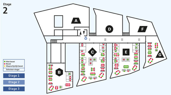
From the elevator lobby, on each level, a longitudinal corridor leads to the different building segments, coded from A to G. The wayfinding system reflects this idea of a main road with left and right turnings on the way. The information is designed as a scheme, using geometrical shapes like circle, square, triangle etc. as an extra element of identity. Meanwhile this technical twist of the graphics refers to Delft as the seat of the renown Technical University Delft.

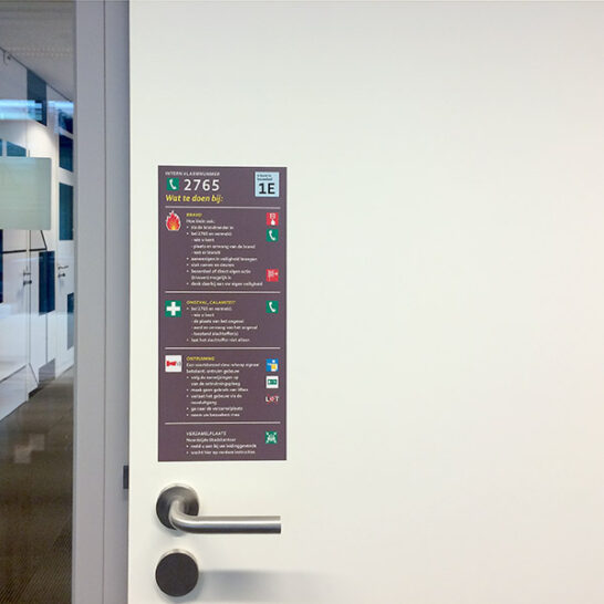
Rather than signs, we speak of wayfinding ‘tags’, flat graphics mounted onto the interior surfaces such as columns, walls, doors and glass panels by means of printed wallcovering and adhesive film.
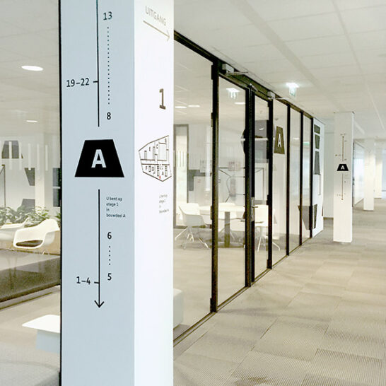

The only physical panels are the elevator signs, made of thick glass panels with a faceted edge, referring to the sloping glass roofs of the building volume. For the service counters we designed three dimensional numbers (channel letters) with adjustable internal light.

The interior mainly has glass partitions, which gives the building its crisp transparency. In the conference centre this created the need for privacy window films. The visual theme is taken from Vermeer’s painting “view of Delft” from 1661.

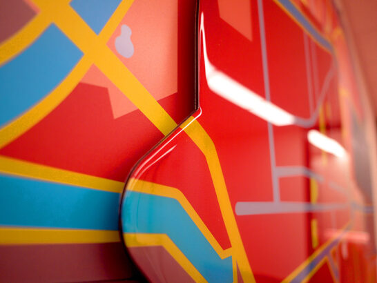
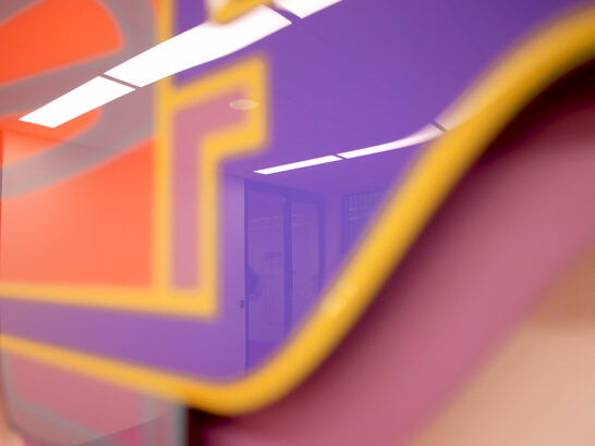
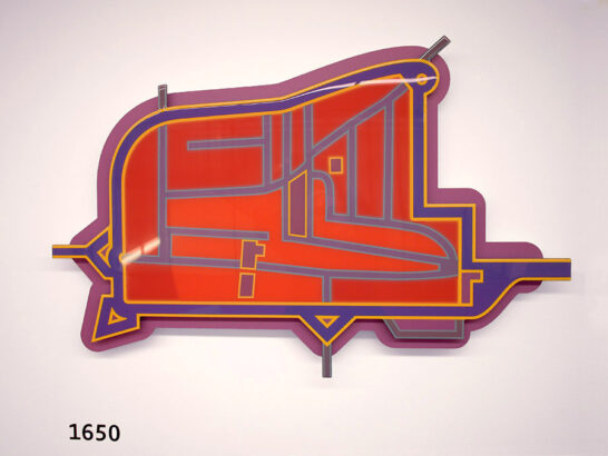
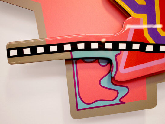
The design of the tunnel, the station and the city hall played an important role in re-uniting the separated East- and West city lobs and restoring some of the old canal structure, thus changing the city map. This lead to the idea to create a large wall piece, consisting of map-like plates, depicting four historical phases in the development of the city plan. The rail track comes (1880) and goes (2018). The town hall lies outside of the former city wall but in the current setting rather central in today’s Delft footprint. Visitors are now presented with this meaningful narrative in which some of the antique fortification plans are still visible in today’s street- and canal patterns. The pieces are carried out in a matte layer with a glossy layer on top.
The wayfinding system has been designed as a family with three members, each catering for a specific need:
Offices
Client Contact Centre
Conference Centre
Over 25 custom pictograms have been designed in different sets: separate waste collection, special purpose rooms, bicycle parking, office supplies storage, Client Contact Centre


The ambition was great, the pressure to be economical with money was just as great. By using the interior surfaces of the building as a canvas for wayfinding tags, we managed to provide a comprehensive wayfinding- and orientation system, consisting of over 600 items.

Background information
The Municipality of Delft took the role as a trailblazer in solving an urban design flaw from the past. Since 1965 the Eastern old center has been cut off from the largest extensions on the West side by a concrete train viaduct. By putting train tracks and station underground, the possibility arose to forge these two city lobes back together. Early on in the planning phase, the idea arose to build a new city hall on top of the station, a contract that, after a competition, was awarded to Mecanoo, located a stone’s throw from the planning area that had meanwhile been coined “Spoorzone”.
Colophon
Design concepts were developed in close co-operation with the Delft internal facility management, Fred van der Loos (wayfinding strategy), Studio Biek (interior design) and the architect. The wayfinding graphics were supplied by MakeCover. The infographic wall piece was supplied by Printed.
Floor suface: 19,430m2
Architect firm: Mecanoo