Elastic maps of Holland 1986–1998
>Wunderkammer
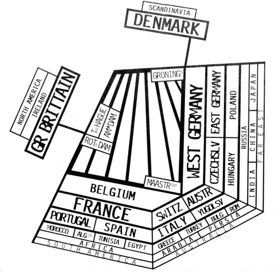
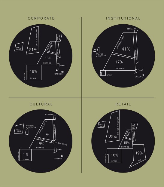
Maps are a graphic interpretation of the physical world. I like subjective maps. Here’s a few I made, The Netherlands being the central theme. The maps are heavily deformed, yet recognizable because some striking features have been kept. The coastline silhouette of the Netherlands proved a rewarding shape to work with.
1. In 1986 I designed the logo for the Ministry of Agriculture and Fisheries*. The coastline does the job well. To be able to squeeze a whole country in a box, I had to stylize it, therefore leaving out one of the so called Wadden Islands, which raised serious questions from the government. (Q: “Where is the fifth island?” A: “We sold it to the Germans to pay for your new identity.”)
2. In 1998 I made a world map by association to be published in Emigré Magazine. The Netherlands is in the centre. The type was made on a Remington typewriter with an IBM ball mechanism, ‘Letter Gothic’. Both the Ministry logo and the Emigré map show my interest in op-art.

3. The four ‘statistic’ maps** I made for the 2/1993 magazine cover of the Dutch Designer’s Association (BNO). The percentage of design market share per field of design, projected for 2003, literally influences the size of a country.

* ) while working at Studio Dumbar 1983-88
**) while partner at Barlock 1991-1997
